
Diskotek
Diskotek
Diskotek
Project Overview
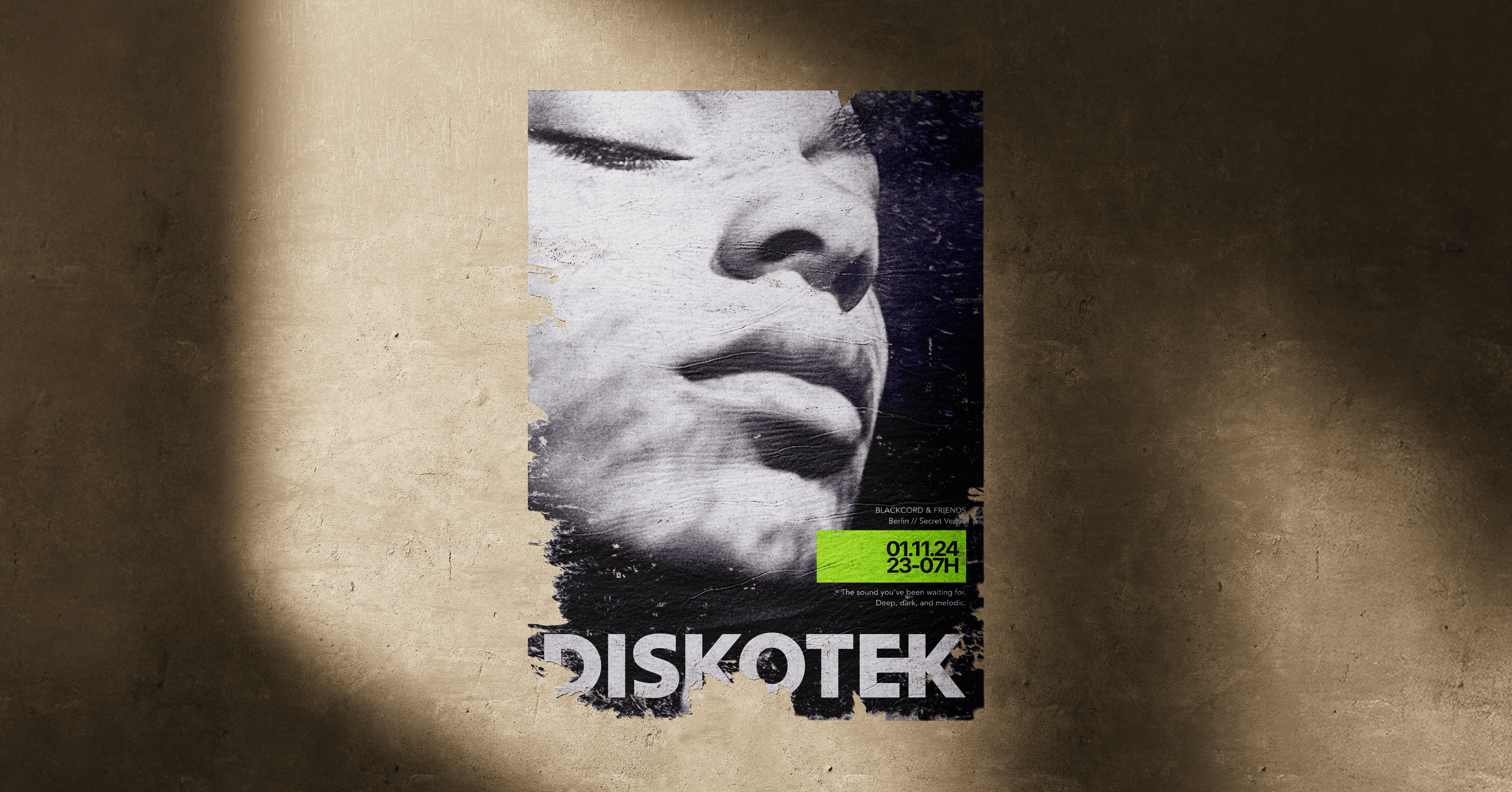
Diskotek is a visual identity concept for an event collective, built around nightlife, rhythm, and atmospheric digital culture.
The brand system combines bold monochrome typography with deep purple gradients, blurred light effects, and structured editorial layouts. The goal was to create an identity that feels premium, energetic, and flexible enough to work across posters, social media, mobile interfaces, tickets, and event communication.
Instead of relying on typical club visuals, the identity uses contrast, motion, and mood to create a recognisable world. The purple gradients act like shifting light in a dark room, while the sharp typography keeps the system clear and functional.
The final result is a bold, adaptable identity designed for contemporary event culture — part digital interface, part poster system, part late-night signal.
Diskotek is a visual identity concept for an event collective, built around nightlife, rhythm, and atmospheric digital culture.
The brand system combines bold monochrome typography with deep purple gradients, blurred light effects, and structured editorial layouts. The goal was to create an identity that feels premium, energetic, and flexible enough to work across posters, social media, mobile interfaces, tickets, and event communication.
Instead of relying on typical club visuals, the identity uses contrast, motion, and mood to create a recognisable world. The purple gradients act like shifting light in a dark room, while the sharp typography keeps the system clear and functional.
The final result is a bold, adaptable identity designed for contemporary event culture — part digital interface, part poster system, part late-night signal.
Diskotek is a visual identity concept for an event collective, built around nightlife, rhythm, and atmospheric digital culture.
The brand system combines bold monochrome typography with deep purple gradients, blurred light effects, and structured editorial layouts. The goal was to create an identity that feels premium, energetic, and flexible enough to work across posters, social media, mobile interfaces, tickets, and event communication.
Instead of relying on typical club visuals, the identity uses contrast, motion, and mood to create a recognisable world. The purple gradients act like shifting light in a dark room, while the sharp typography keeps the system clear and functional.
The final result is a bold, adaptable identity designed for contemporary event culture — part digital interface, part poster system, part late-night signal.


